CMSC 320 Final Tutorial - Pratham Ashar & Austin Thomas

Understanding Today's NBA

This website is written as a step-by-step tutorial rather than a project summary. The goal is to walk a reader from raw basketball data, through preprocessing and exploratory analysis, into machine-learning models and final interpretation.

65,698 Games from the 1946/47 – 2022/23 seasons

Header

Contributions and project roles

Pratham Ashar

  • A: Proposed the NBA topic and framed the core research questions.
  • B: Built the SQLite-to-analysis pipeline and organized the derived tables.
  • D: Designed the classification, clustering, and regression approach.
  • G: Wrote and assembled the final tutorial narrative.

Austin Thomas

  • C: Led the exploratory data analysis and summary-statistics conclusions.
  • E: Performed model training, validation, and test-set analysis.
  • F: Created major result figures and interpretation of outputs.
  • G: Helped revise the final report into publication form.

1. Introduction

What we wanted to learn from historical NBA data

Basketball produces a rich, unusually detailed historical record. Every game ends with a score, every season reflects a specific strategic era, and the play-by-play logs capture event-level information about how points, rebounds, and turnovers are produced. That makes the NBA a strong setting for a data-science tutorial.

We organized the project around three questions. First, can we predict whether the home team wins using only information known before tip-off? Second, do player box-score patterns reveal stable statistical archetypes? Third, how well can we predict the total number of points scored in a game?

These questions matter because they mix descriptive and predictive goals. They let us ask what changed in the league over time, what stayed stable, and how much of the game is explainable with simple tabular features.

Q1

Home-win prediction

Can recent team form and era effects explain the probability that the home team wins?

Q2

Player archetypes

Can simple player-season box-score averages recover recognizable roles?

Q3

Total scoring

How well can we predict a game’s final total, and which features matter most?

2. Data Curation

Choosing a dataset that supports both history and modeling

Our data comes from Wyatt Walsh’s NBA Historical Dataset, which aggregates data from the official NBA Stats API. We selected it for four reasons: scale, historical depth, multiple grain levels, and a relatively clean relational schema.

The tables most relevant to our analysis are `game`, `play_by_play`, `other_stats`, and `common_player_info`. The `game` table gives us game-level targets; the `play_by_play` table lets us reconstruct player-game contributions; and the player-information table lets us move to season-level summaries.

Step 2.1

Connect to the SQLite database

Before asking any basketball question, we need to verify what is actually in the dataset and what level of granularity each table supports.

import sqlite3
import pandas as pd

DB_PATH = 'nba.sqlite'
conn = sqlite3.connect(DB_PATH)

tables = pd.read_sql(
    "SELECT name FROM sqlite_master WHERE type='table'", conn
)
print(tables.to_string(index=False))

This matters because it determines what kinds of analysis are even possible. A project built only on box scores would not support event-level parsing, while a project built only on play-by-play would make simple game-level prediction more cumbersome.

Step 2.2

Inspect the candidate tables

We next check column availability in the tables most likely to support our three questions. This is where curation decisions begin: we do not need every field, but we do need to know which tables contain team identity, dates, event types, and player names.

for table in ['other_stats', 'play_by_play', 'common_player_info']:
    df = pd.read_sql(f"SELECT * FROM {table} LIMIT 3", conn)
    print(f"\\n=== {table} ===")
    print(df.columns.tolist())

At this point, the project becomes concrete. We know that `game` can support classification and regression, while `play_by_play` can support the derived player-season analysis used in the archetype section.

3. Preprocessing

Turning raw tables into analysis-ready frames

Step 3.1

Load and normalize the game table

The game table is our backbone. We parse the date, derive a season label, convert scores to numeric form, and remove rows without valid final scores.

games = pd.read_sql("SELECT * FROM game", conn)
games['game_date'] = pd.to_datetime(games['game_date'], errors='coerce')
games['season_year'] = games['game_date'].dt.year.where(
    games['game_date'].dt.month >= 10,
    games['game_date'].dt.year - 1
)
for col in ['pts_home', 'pts_away']:
    games[col] = pd.to_numeric(games[col], errors='coerce')
games.dropna(subset=['pts_home', 'pts_away'], inplace=True)

This step seems simple, but it is critical. If the season label is wrong, then every era-level plot and every time-aware train/test split becomes misleading.

Step 3.2

Parse play-by-play rows into player-game statistics

The raw event table does not directly give us the player-season features we want. We have to reconstruct them by classifying made field goals, free throws, rebounds, and turnovers.

pbp = pd.read_sql(
    """SELECT game_id, eventmsgtype, eventmsgactiontype,
              player1_id, player1_name, player1_team_abbreviation,
              homedescription, visitordescription, score
       FROM play_by_play
       WHERE eventmsgtype IN (1, 2, 3, 4, 5)""",
    conn
)

made_shots = pbp[pbp['eventmsgtype'] == 1].copy()
desc = made_shots['homedescription'].fillna('') + made_shots['visitordescription'].fillna('')
made_shots['is_3pt'] = desc.str.contains('3PT', case=False).astype(int)
made_shots['pts'] = made_shots['is_3pt'].map({1: 3, 0: 2})

This is the most “data science pipeline” part of the project. We are not just loading a ready-made CSV; we are deciding how event codes should become basketball variables.

Step 3.3

Build player-game and player-season tables

Once events are classified, we aggregate them to player-game rows and then to player-season averages. This gives us the unit of analysis for our player-archetype work.

box = scoring.merge(rebounds, on=['game_id','player1_id','player1_name'], how='outer')
box = box.merge(turnovers, on=['game_id','player1_id','player1_name'], how='outer')
box.rename(columns={'player1_name': 'player_name', 'player1_id': 'player_id'}, inplace=True)
box[['pts','reb','tov']] = box[['pts','reb','tov']].fillna(0)

player_season = (
    box_with_season
    .groupby(['player_name', 'player_id', 'season_year'])
    .agg(
        games_played=('pts', 'count'),
        pts_pg=('pts', 'mean'),
        reb_pg=('reb', 'mean'),
        tov_pg=('tov', 'mean'),
    )
    .reset_index()
)
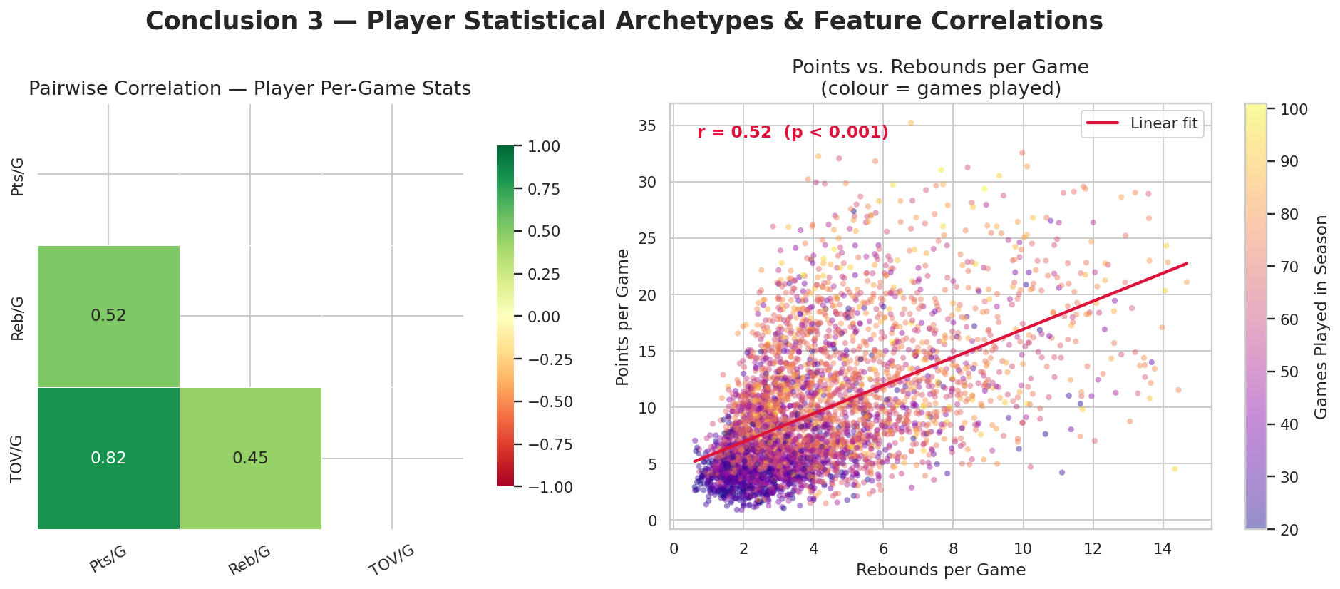
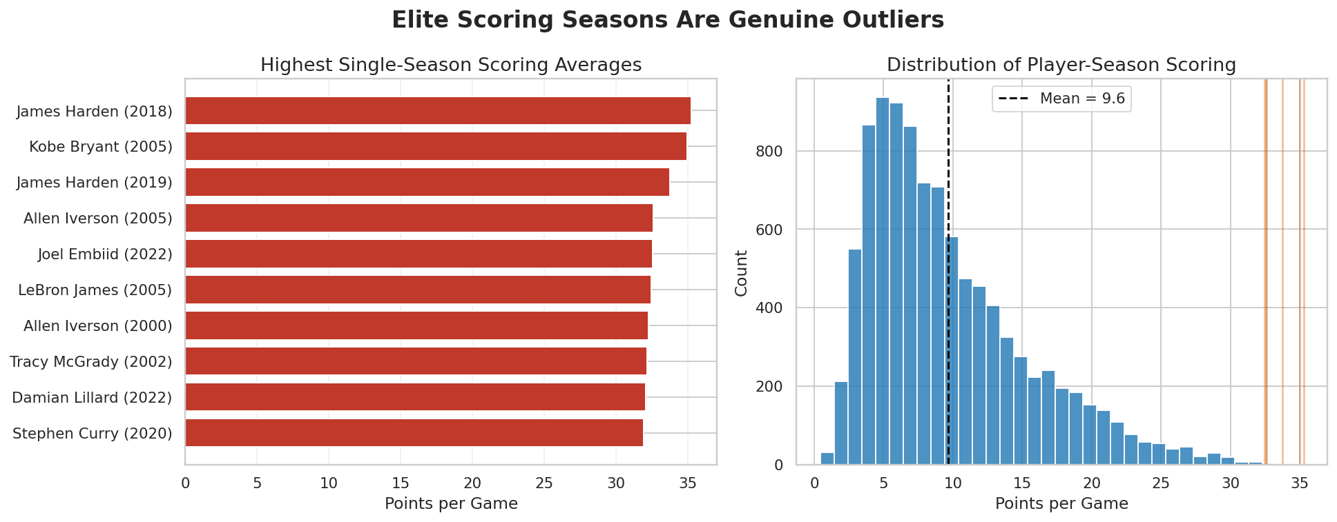
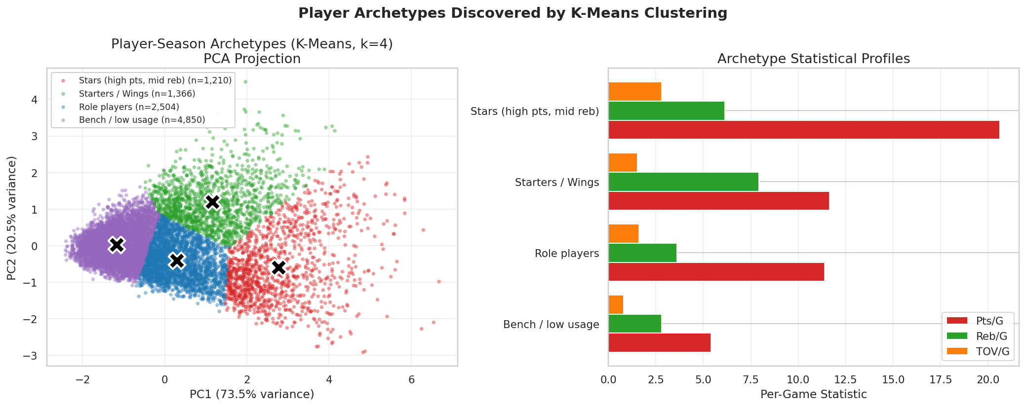
player_season = player_season[player_season['games_played'] >= 20].copy()

The minimum-games threshold is important. Without it, short and noisy seasons would dominate the tails of the distribution and make the player plots less trustworthy.

Step 3.4

Create derived game-level targets

We also enrich the game table with exactly the targets we want to study later: `total_pts`, `home_win`, and `point_diff`.

games['total_pts']  = games['pts_home'] + games['pts_away']
games['home_win']   = (games['pts_home'] > games['pts_away']).astype(int)
games['point_diff'] = games['pts_home'] - games['pts_away']

This gives us a clean bridge from exploratory analysis to supervised learning. The target variables are now explicit and queryable.

4. Exploratory Data Analysis

Using descriptive statistics and hypothesis testing to decide what matters

The exploratory stage answers two different questions. First, what does the dataset look like numerically? Second, what patterns are strong enough to motivate a later machine learning model? We therefore summarize the data and then present three specific conclusions, each tied to a statistical method.

Step 4.1

Start with summary statistics

Before running any test, we need to know whether the data has the right scale and coverage for our project.

print('=== GAMES TABLE ===')
display(
    games[['pts_home', 'pts_away', 'total_pts', 'home_win', 'point_diff']]
    .describe().round(2)
)

print(f'Unique players: {box[\"player_name\"].nunique():,}')
print(f'Season range: {games[\"season_year\"].min()} – {games[\"season_year\"].max()}')
print(f'Total games: {games.shape[0]:,}')

This is where we confirm that the dataset is large enough and broad enough to justify both historical analysis and model fitting.

Conclusion 1

Home teams do score more, and they win more often

We test whether home scoring exceeds away scoring using a one-sided two-sample independent t-test.

home_pts = games['pts_home'].dropna()
away_pts = games['pts_away'].dropna()

t_stat, p_val = ttest_ind(home_pts, away_pts, alternative='greater')
print(home_pts.mean(), away_pts.mean(), p_val)

The result is decisive: home teams average 104.62 points versus 100.99 for away teams, with a gap of about 3.63 points per game. The t-statistic is extremely large and the p-value is effectively zero, so we reject the null hypothesis that home and away scoring means are equal in favor of the directional alternative that home teams score more.

The figure lets us go one step further than the test. It shows that the home advantage is not just present on average; it also changes historically. Home win rate falls from roughly 68.3% in 1947–69 to about 57.5% in 2010–22. So our first conclusion is not simply “home teams win more.” It is that home-court advantage is a real and statistically supported signal, but one that has weakened over time and therefore should be treated as era-sensitive rather than fixed.

This directly motivates the first machine-learning task. If home advantage is real but imperfect, then predicting home wins is a meaningful classification problem rather than a trivial rule.

Home versus away scoring distributions and era-level home win rates
The test confirms the mean gap; the era bars show that the gap is shrinking.

Conclusion 2

The scoring environment changed, but not as a simple upward line

We first tried a Pearson correlation between season year and average total points in the post-1980 era.

modern = season_scoring[season_scoring['season_year'] >= 1980].copy()
r, p = pearsonr(modern['season_year'], modern['avg_total_pts'])
print(f'Pearson r = {r:.4f}, p = {p:.4e}')

This produced one of the most interesting surprises in the project. Visually, scoring absolutely changes across eras. But the simple post-1980 linear relationship is weak: r = -0.122 with p = 0.4358. Because that p-value is far above 0.05, we should fail to reject the null hypothesis for this specific Pearson test.

That does not mean the scoring story disappears. It means the story is not well captured by one straight-line relationship over the whole modern era. The plot shows visible historical phases: very high scoring in the early decades, a slower and more defensive environment in the late 1990s and early 2000s, and then a renewed scoring rise in the pace-and-space era after roughly 2015.

So the correct second conclusion is more nuanced: NBA scoring changed substantially, but the change is nonlinear and era-based, not one statistically significant linear post-1980 trend. That is exactly why season-year remains useful in later models: not because the Pearson test proved a straight-line relationship, but because year acts as a rough proxy for changing strategy, pace, and shot selection.

Scoring trends over time and home-away scoring by season
The visual evidence supports structural shifts in the league, even though a single linear test is too blunt.

Conclusion 3

Player-season box scores have meaningful statistical structure

We test dependence between high scorers and high rebounders using a chi-square test and complement it with a correlation view.

ps['high_scorer'] = (ps['pts_pg'] >= ps['pts_pg'].quantile(0.75)).astype(int)
ps['high_rebounder'] = (ps['reb_pg'] >= ps['reb_pg'].quantile(0.75)).astype(int)

ct = pd.crosstab(ps['high_scorer'], ps['high_rebounder'])
chi2, p_chi, dof, expected = chi2_contingency(ct)

The point is not just that the p-value is small. In our actual setup, the test asks whether being a high scorer and being a high rebounder are independent events in the player-season data. The answer is no: the chi-square result is strongly significant, so we reject independence.

The correlation heatmap and scatter plot help interpret that result. Points, rebounds, and turnovers do not float around independently; they form recognizable statistical patterns. Higher-usage offensive players tend to accumulate points and turnovers together, while rebounds add another dimension of role identity. That means the player-stat space is visibly structured rather than random.

The outlier analysis strengthens this conclusion. Elite scoring seasons sit far into the right tail of the distribution, which suggests that the dataset contains genuine star-level profiles rather than only mild variation around a league average. Together, these findings justify using clustering later: if player-season features are dependent, patterned, and occasionally extreme, then unsupervised role discovery is a reasonable next step.

Correlation heatmap and player points versus rebounds scatter
Even a simple three-feature player profile shows clear structure and dependence.

We also check whether the highest-scoring player seasons are just noise or genuine outliers. They turn out to be genuine outliers, which helps justify later role-based interpretation.

top10 = ps.nlargest(10, 'pts_pg')[['player_name', 'season_year', 'pts_pg']]
ps['pts_z'] = stats.zscore(ps['pts_pg'].fillna(0))
outliers = ps[ps['pts_z'] > 3]

That is useful for the tutorial because it shows that the player-level dataset contains historically meaningful extremes, not just smooth averages.

Top player scoring seasons and scoring distribution
Elite scoring seasons sit far into the right tail, which makes them analytically interesting rather than suspicious.

5. Primary Analysis

Choosing models that match the questions we asked

The EDA stage told us three things. Home-court advantage is real but shrinking, scoring behaves in eras, and player statistics are structurally related. Those findings directly motivate our model choices: classification for home wins, clustering for player roles, and regression for total points.

Step 5.1

Build rolling pre-game features for home-win prediction

We deliberately restrict the classification task to information knowable before the game starts. That makes the prediction problem honest.

clf_games = games[games['season_year'] >= 1980].copy()
clf_games['is_playoff'] = clf_games['game_id'].astype(str).str.startswith('004').astype(int)

clf_features = [
    'season_year', 'is_playoff',
    'home_team_recent_pts', 'away_team_recent_pts',
    'home_team_recent_wins', 'away_team_recent_wins'
]

We then use a time-aware split, training on 1980–2016 and testing on 2017–2022. This avoids leaking future seasons into the past.

Classification

Predicting whether the home team wins

We fit logistic regression for interpretability and random forest for non-linear flexibility.

logreg = LogisticRegression(max_iter=1000, random_state=RANDOM_STATE)
logreg.fit(X_train_scaled, y_train)

rf = RandomForestClassifier(
    n_estimators=300, max_depth=8, min_samples_leaf=20,
    random_state=RANDOM_STATE, n_jobs=-1
)
rf.fit(X_train, y_train)

Both models end up near 0.637 ROC-AUC on the held-out test set. That is better than chance and better than the naive “always pick home” baseline, but it is still modest. The interpretation is that recent form matters, yet a large fraction of NBA game outcomes remains noisy at this feature level. The test-set home-win rate of 56.4% is also lower than the all-time 61.9% rate from Section 4.2 because this split only covers the modern 2017–2022 seasons, when home-court advantage is weaker than it was historically.

Classification results including ROC curves and feature effects
Recent win rate and recent scoring are more influential than the playoff flag, and the gains over baseline are real but limited.
Step 5.2

Use clustering to look for player archetypes

The player question is unsupervised: we do not already know the “correct” labels. That makes K-Means a natural choice for discovering broad statistical roles.

ps_clust = player_season.dropna(subset=['pts_pg', 'reb_pg', 'tov_pg']).copy()
X_clust = StandardScaler().fit_transform(ps_clust[['pts_pg', 'reb_pg', 'tov_pg']])

for k in range(2, 9):
    km = KMeans(n_clusters=k, random_state=RANDOM_STATE, n_init=10)
    labels = km.fit_predict(X_clust)

The diagnostics matter here. In our rerun, the silhouette score is actually highest at k = 2 at about 0.487, while k = 3, k = 4, and k = 5 all sit much lower and very close together near 0.36. So the strongest purely geometric split is a coarse 2-group separation. We still proceed with k = 4 because the elbow bends around 3 to 4 clusters and the 4-cluster solution is much easier to interpret in basketball terms. In other words, k = 4 is a domain-informed choice for readability, not a strict silhouette optimum.

Elbow and silhouette diagnostics for choosing the number of clusters
Silhouette clearly prefers k = 2, but the elbow curve starts to flatten around k = 3 to k = 4, which is why we treat 4 clusters as an interpretability choice rather than a mathematically unique answer.

Clustering

The 4-cluster solution is visually clean and semantically richer

Once we accept that tradeoff, the resulting archetypes are useful. The PCA projection is clean, and the first two components explain about 94.0% of the variance in the 3-feature space, so the 2D view is a fair summary rather than a misleading projection.

The centroid profiles are also easy to read: the Stars cluster averages about 20.6 points, 6.1 rebounds, and 2.8 turnovers per game, while the Bench / low usage cluster sits much lower across all three statistics. The other two clusters split into a rebound-heavier starter group and a lighter-usage role-player group.

PCA scatter of player archetypes and centroid profile chart
The PCA scatter and centroid bars make the interpretation concrete: stars, rebound-heavy starters, role players, and low-usage bench seasons separate well enough to tell a coherent basketball story.
Step 5.3

Predict the total number of points in a game

Total points is a continuous target, so we switch to regression. We re-use the same rolling pre-game features and compare linear regression with random forest regression.

lr = LinearRegression()
lr.fit(X_train_r_scaled, y_train_r)
y_pred_lr = lr.predict(X_test_r_scaled)

rfr = RandomForestRegressor(
    n_estimators=300, max_depth=10, min_samples_leaf=20,
    random_state=RANDOM_STATE, n_jobs=-1
)
rfr.fit(X_train_r, y_train_r)
y_pred_rfr = rfr.predict(X_test_r)

The rerun results are more modest than our early expectations. Linear regression performs slightly better than the random forest here, with about 15.37 MAE and R² = 0.21. That means the model captures some scoring structure but leaves a great deal unexplained. With only six features and substantial irreducible noise in NBA game totals, the random forest’s extra flexibility likely translates into mild overfitting, while linear regression’s simpler form generalizes slightly better. It is a useful reminder that “more flexible” does not automatically mean “more accurate.”

Regression

Game-total prediction works, but only weakly

The regression plots make this limitation visible. The model tracks average season scoring reasonably well, but the individual-game scatter remains wide and residual spread is substantial.

That is still useful. It tells us that recent offensive environment is a real signal, just not a sufficient one for tight prediction.

Regression diagnostics for predicting total points
Recent scoring features dominate the model, while variance at the single-game level remains high.

6. Visualization

Putting the entire pipeline back on one page

The final visualization task is not just to make pretty plots. It is to synthesize the full story: historical context, EDA findings, and predictive performance. The scoreboard below does that by placing the two supervised-learning tasks side by side.

Model scoreboard for home-win and total-points analysis
The classification task improves over a naive baseline, while the regression task remains materially noisy.

Why keep the notebook export too?

This page is the guided narrative version of the project. The full exported notebook at CMSC320_Final_Project.html is the direct submission-ready tutorial artifact: a single self-contained page mixing prose, code, and outputs. Together, the two pages give a reader both the polished story and the underlying computational walkthrough.

7. Insights and Conclusions

What an informed reader should take away

Main takeaways

  • Home-court advantage is statistically significant, but the size of that advantage declines across eras.
  • The post-1980 Pearson test does not support a single linear scoring trend, even though the visual history clearly shows major era-based changes.
  • Player-season box-score features are not independent and contain enough structure to motivate archetype discovery.
  • Simple pre-game models improve on naive baselines, but they remain modest rather than highly predictive.

What we would do next

  • Add richer player and team features such as assists, shooting efficiency, rest, and injuries.
  • Push further into sequence modeling with the play-by-play table.
  • Refine the player-archetype section with a fully regenerated clustering pipeline.
  • Compare modern-only and cross-era models more explicitly.

The strongest lesson from the project is that careful data curation and step-by-step exploration let us separate strong historical structure from irreducible uncertainty. The result is not a perfect predictive system; it is a more honest, better-supported explanation of what the NBA data can and cannot tell us.